Science knows no country, because knowledge belongs to humanity and is the torch which illuminates the world.
~ Louise Pasteur
Apply
The last, and arguably the most important part of science communication is showing people the impact that their choices have. I think a lot about environmental issues and the conservation of our oceans. Getting people to connect to these issues and feel like their actions have an impact is invaluable. It is fine to conduct science because it is interesting and share that with other scientists. It is a bit better to get non-scientists excited about science, but the cherry on top is showing people the impact that they have on the world around them.
This section contains pieces that I have written to inform people about the impact that we are having on the oceans and how our decisions influence conservation efforts. It is so important for people to believe that they have faculty in these matters and effective science communication can provide that belief.
Scroll down to view each of the pieces in this section in the order that they were made, or click on one of the buttons below to jump directly to that work.
Plastics in the South Pacific subtropical gyre
As soon as I learned about Stanford@SEA I knew it was something that I wanted to do. Having the ability to live and learn on a ship was one of my goals, not to mention that I would also be able to conduct independent research while aboard the ship. When I arrived at Hopkins Marine Station where we would have our classes for the first five weeks of the quarter before heading out on the ship, I had so many ideas for a project that it felt as if there were too many to choose from.
I had recently read an article about plastics found in the Marianas Trench (the deepest part of the ocean) and thought that looking at something related would be a super interesting way to look at how we humans impact the oceans that so many of us rely on. After presenting this idea to the class, one of my classmates expressed her interest in partnering with me. From then until the end of the quarter we worked together to figure out our project, alter it when we weren’t able to complete our original plan, and figure out how to analyze and report our findings at the end of the quarter. For both of us, this was our first time conducting independent research. We didn’t really know what we were getting ourselves into.
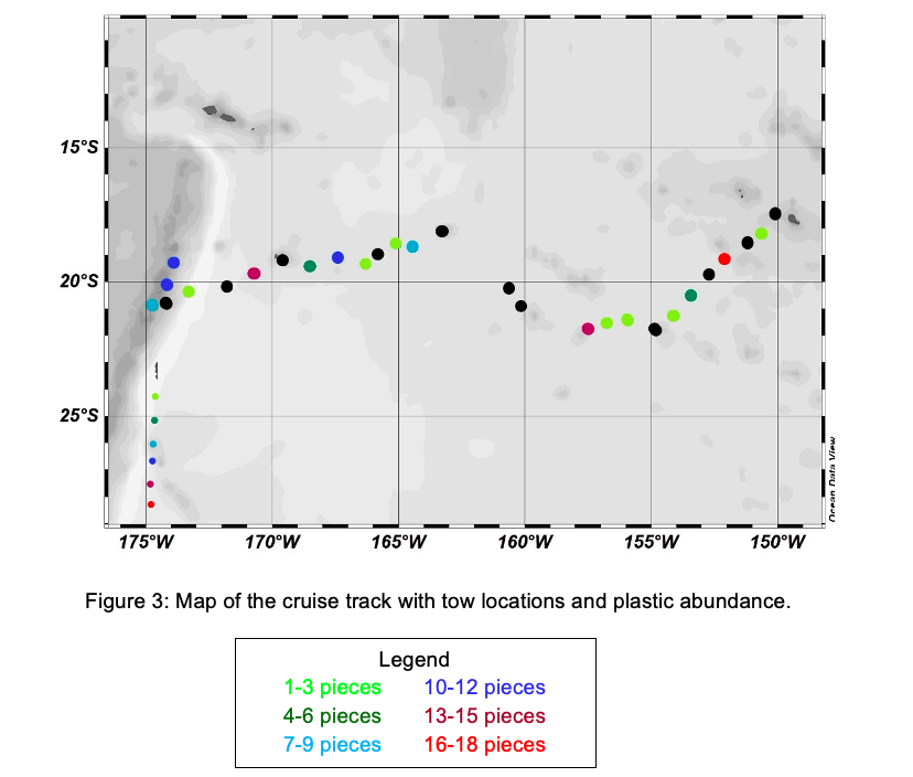
We ended up focusing on the gradient of plastics found in the open ocean along our cruise track. We were able to collect plastics and gather interesting data on how the abundance of microplastics shifts as you move west from the boundary of the South Pacific Subtropical Gyre.
As our deliverable for the Stanford@SEA class, everyone was required to turn in a scientific report on their research at the end of the quarter. That meant, for most of us, we would be conducting the analysis for and writing our first scientific report aboard a 134-foot-long tall ship in transit from Tonga to American Samoa. This not only limited our resources for looking information up and getting advice on our analysis, though our TAs were wonderful, for those of us working with partners, we also had to figure out times in between the different watches that we stood to go over our projects. Writing any scientific paper since that has been much easier, at least logistically.
The fact that it was our first-ever technical paper meant that we didn’t have a lot of experience and knowledge to call upon in constructing our figures and paper as a whole. When looking back on this paper, the area where I see the most opportunity for growth is the figures and the figure captions as an agent for telling the story of the research. Obviously, there is always room for improvement when it comes to writing, but in this paper in particular the figures stand out to me as an area for improvement. As a person, I really like being colorful and I always thought that more color made things more interesting, so the figures in this paper all have lots of color in them. Which causes them to catch your eye, but it doesn’t really encourage you to focus on the most important data within the figure.
I took a class in my junior year for the Notation in Science Communication on data visualization and learned a lot about leveraging color to focus your reader’s attention on the most important data within the figure. This caused me to reflect on these figures and when I revised this paper to try to publish it I focused on the intentionality of my use of color. I also focused on making sure that the figure captions were complete and a reader could go through and only read the figure captions while looking at the figures and still get the gist of the paper.
Originally when we were writing the figure captions we didn’t want to be redundant in our information. So I wrote them very short, just as a quick introduction to the information within the figure. Now I know that being slightly redundant in the figure captions is OK because rarely do people read the full text and the captions, and if they do this should be the most important information, so it is ok to reiterate it within the figure captions.
“In writing this paper the first time I learned a lot about the process of writing a technical paper, and since then I have learned even more about how to make the text and figures work together as a cohesive unit to tell the story of your research.”
Sharks are friends, not food
This is an infographic I created for a data visualization class I took for the Notation in Science Communication. With this infographic, I wanted to use my new data visualization skills to inform the public about the detrimental effects of catching sharks as bycatch. The goal was that this would be something that could be widely disseminated at farmer’s markets and more sustainable fish markets or grocery stores. I wanted to make people aware of the horrible numbers of sharks that are “accidentally” being caught and released to potentially live another day. I wasn’t trying to convince someone that they should care about the environment or our impact on it but was working to make people aware of just how big our impact is.
Writing for a more informed audience like this meant that I could spend more time on the data that I was presenting and less effort trying to convince people that they should care. This does mean that for those complete climate-change-deniers or people completely ignorant to the fact that we have an impact on the world around us there isn’t as much direct persuasion in my infographic. On the other hand, for those who are on the fence, or may admit we have an impact but don’t see themselves as having any power to change that, I show them exactly why this is an area they should care about and what they can do to lessen their impact.
Since this is an infographic and meant for broader distribution there are fewer words and each phrase holds a lot of importance. This also means that the images and visualizations included are that much more important in their role within the story. For this reason, I do wish there was a bit more room to have larger visualizations, but in an effort to make this infographic one page front and back this wasn’t possible. Instead, I could have made some of the text on the visualizations larger so it is easier to read. So far I have only looked at this infographic on the computer where it is easy to zoom, so that didn’t seem like as big of a problem, but if I ever were to print this and put it out for general dissemination I would want to make sure that everything is easily legible on paper, as well as on the computer.
That said, the visualizations themselves are a big improvement from my earlier data visualizations.
“I made very intentional decisions around color and used it (as well as boldfaced text) to draw attention to key phrases and concepts.”
This makes the key data points really stand out in the visualizations creating an easy-to-follow story within the data. Having this cohesive story being told through each medium used in a piece of communication is something that I have really valued learning about in the Notation in Science Communication. This infographic really shows how I have been able to integrate the data and the text to tell one story. This is a skill that I want to continue to hone and use in my future communications as well.
Marine Protected Area Recommendations
In the fall of my senior year, I was taking a class entitled “Human Society and Environmental Change.” For the final project in this class, we were put into groups and prompted to create a racial equity action plan for an environmental issue that the group members were interested in. My group and I decided to look into how we can better create Marine Protected Areas (MPAs) that are conscientious of and respectful towards the people that are connected to that span of the ocean. I helped to drive this project forward and focused mostly on the environmental impacts of MPAs for our final infographic.
For this project, we wanted to create something that could easily be disseminated to the community as well as policy-makers, because we recognized the importance of community involvement when creating an MPA. An infographic allows for important information to be shared with a wide range of people so that everyone can be informed and involved in the process of protecting our oceans. The mode of communication for this project was pivotal in defining its audience and the impact that this piece of communication can have. Through the use of text, images, and easily digestible facts we created a resource for community members and policy-makers alike, to help guide them to produce culturally sensitive MPAs.
“The mode of communication plays an important role in the effectiveness of that communication.”
We could have put the same information into a policy brief format and the audience would have been completely different. Making sure to think critically about how your audience is going to interact with your communication is very important. Understanding what mode of communication would best facilitate the kind of interaction that you want readers to have with your work is vital to effective communication, and something I have learned to be very intentional about.
30x30 in the United States
For my Geographic Information Systems (GIS) course we were given the prompt to conduct a final project using GIS data and produce a story map out of our project. This left the project content and scope up to each student to pick a topic and develop a project around something that they are interested in. I really wanted to keep thinking about Marine Protected Areas and particularly the 30x30 resolution that was introduced into the US senate to protect 30% of our national lands and waters by 2030. I then developed an approximation of what it would look like if 30% of the waters around the contiguous United States were highly protected.
In developing my story map I thought a lot about organization and design. I learned how to use the Story Map framework to create a dialogue between the maps that I was presenting and the information that I was writing about. Figures and images are such a powerful way to convey information, but it can be challenging to balance the information that is included in the figures with the information in the text, so the two components of a piece of communication are supporting each other and not redundant. Through thoughtful design and use of maps in this project, I was able to cultivate a conversation between the maps and the text. This allowed readers to fully grasp what 30x30 means and what it will look like when we complete this goal.
By incorporating maps and text and creating this purely theoretical visual I have been able to show readers exactly what needs to be done to meet this goal. Through effective communication, we can show readers exactly why science is important and exactly how they can contribute to science and the protection of the world around them.
“Through this project, I learned how to develop a story and powerful visuals that work together to show readers what changes need to happen and how they can be a part of that change. ”
This interplay between words and visuals and how they can work together to show the public new science, as well as what the impacts of that science might be is something that I will continue to use throughout my career. The most important part of science communication is helping people understand a concept so they can make informed decisions around it. Through this project, I gained valuable knowledge in how to do just that effectively.


